Fora Travel
Deleón Tequila
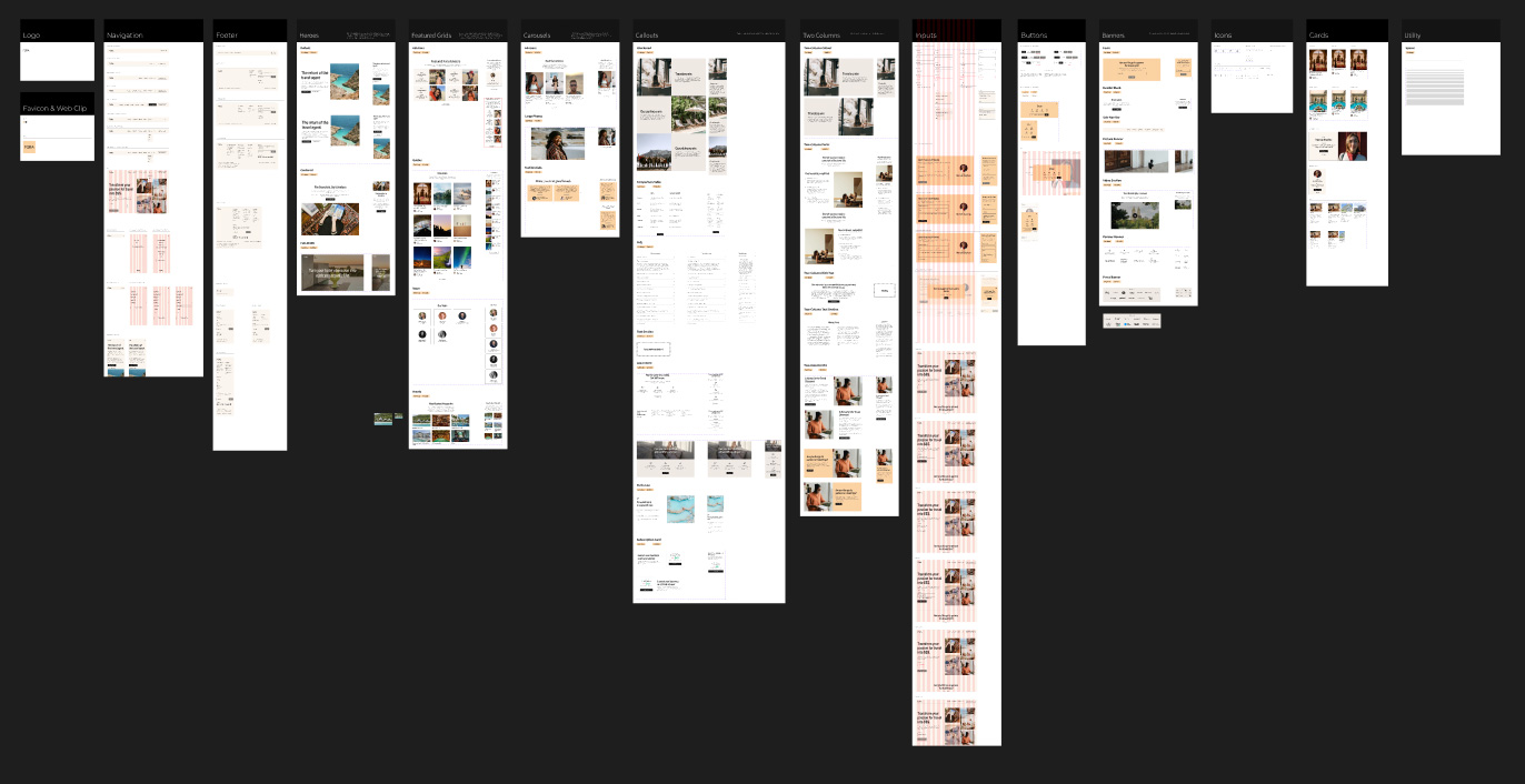
UX Process Definition
For the past year, I've helped the tech-forward startup bring their UX practice in-house to decrease their turnaround time from prototype to production. A new design system with standard measurements and naming conventions was one of the key innovations in the process.
Let's take a deeper look at the results and thinking involved.
Graphic designer and retoucher for the launch of Deleon Premium branded Tequila. Due to tight deadlines, campaign imagery was assembled live in sequence with the in-studio shoot. A 360 campaign was created, serving print, digital, social and OOH channels.
Graphic designer and retoucher for the launch of Deleon Premium branded Tequila. Due to tight deadlines, campaign imagery was assembled live in sequence with the in-studio shoot.
A 360 campaign was created, serving print, digital, social and OOH channels.
Contributions
Contributions
- Design System Ownership
- Lead UX Designer
- Technical Partner
- Design Direction
- Retouching

Major Takeaways
Building The Banner
Having been recently named travel startup of the year, Fora's GTM design and strategy have been well-received.
The agency's sales, promotion, and onboarding funnels have been redesigned, allowing for substantial growth in their relevant metrics -- including agents joined, trips booked, and partnerships created.
We collaborated with Aaron, influencer and owner of a popular subway photography themed instagram account, to shoot the main visuals for the project.
After combing through 2,000+ selects, we found the statement shot for the store.
The large-scale graphic now greets each customer as they close the checkout process.
Localizing the UX practice has also allowed the team to send component changes to market within 3 weeks, a major reduction from 4-6 months.
We collaborated with Aaron, influencer and owner of a popular subway photography themed instagram account, to shoot the main visuals for the project.
After combing through 2,000+ selects, we found the statement shot for the store.
The large-scale graphic now greets each customer as they close the checkout process.


Consistency is Key
My first order of operations was to audit the current Figma workspace. I quickly discovered the system at large had incorrect alignments, naming conventions, and padding styles making both asset creation and handoff a challenge.

Components were grouped by function (pic above), renamed, with descriptions added to help stakeholders easily search the repository when needed.
Variants and auto-sizing were then added to each piece to help standardize & speed the mockup process. Spacer components were added instead of padding, allowing for proper translation on component borders.
These changes alone reduced the cycle time for ideation immensely.
Figma component optimized for production use.
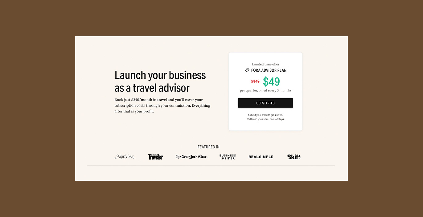
Money Matters
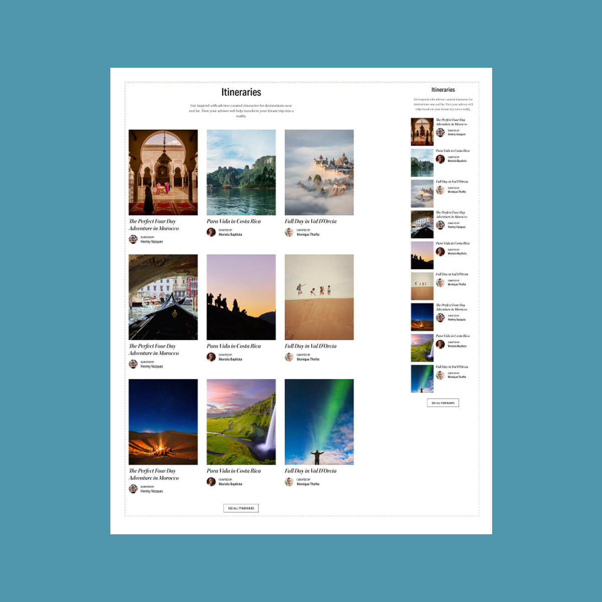
With a consistent design library in place, my efforts were pointed toward iterating content that could attract new users. In tandem with the marketing team, we introduced a marketing funnel and editorial content to help with recruiting efforts.
The pricing strategy and components have paid off instantly, with over 100% growth in user signups each mth since adoption.

Facing a facelift
User feedback and data (daily active users) told us that the user profile pattern used in market wasn't effective. I lead design sprints also collaborated with our tech partners to ensure any data passed wouldn't add to our load times.
After weeks of refining our current pattern is live in market and performing amazingly -- both daily and active monthly usage have rebounded and climbed. Users cite pride in using the product, even ditching their own marketing platforms for their new profiles.
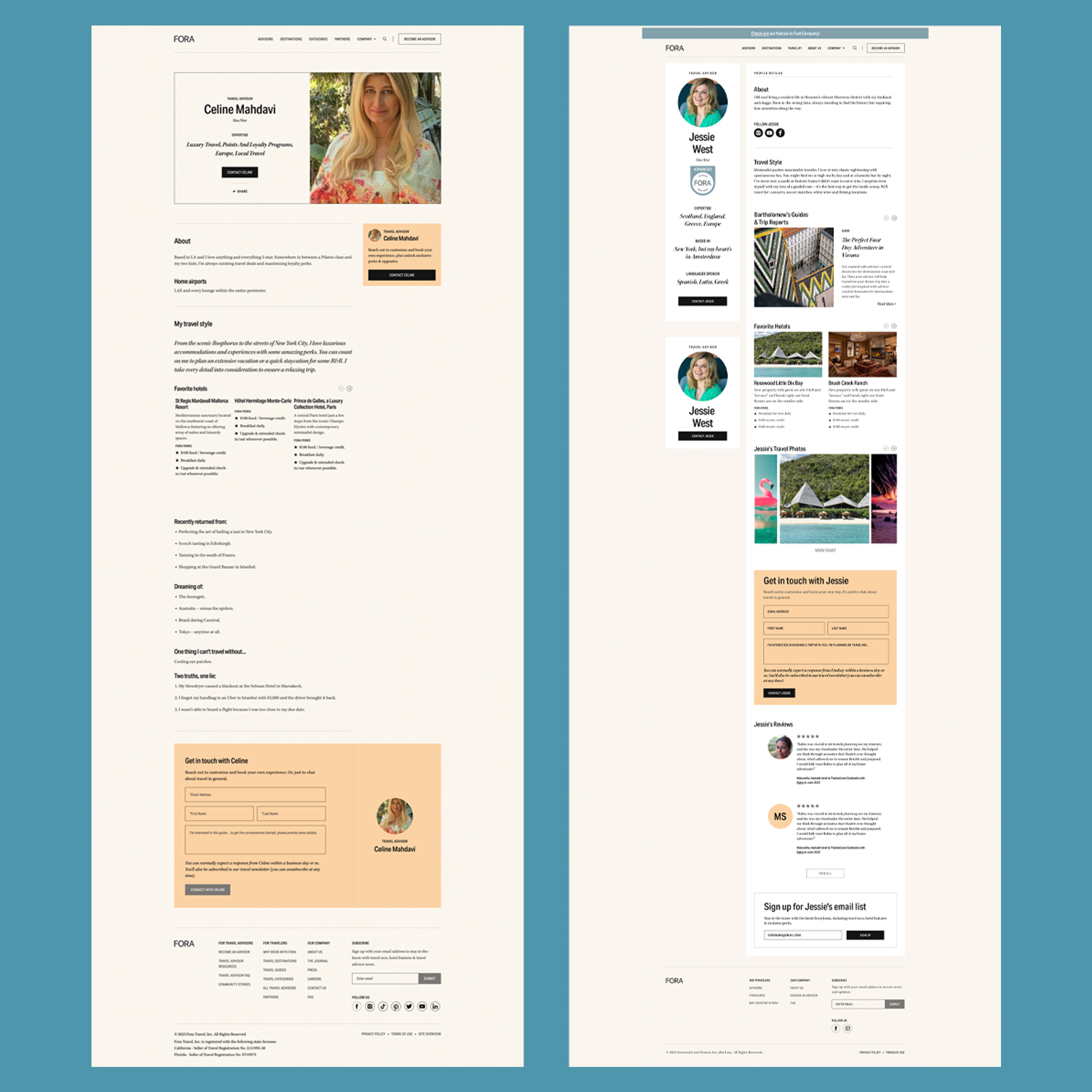
Before and after presentations of the user profile